primary
Walnut
--primary- HSL
- hsl(24, 20%, 15%)
- HEX
- #2E251F
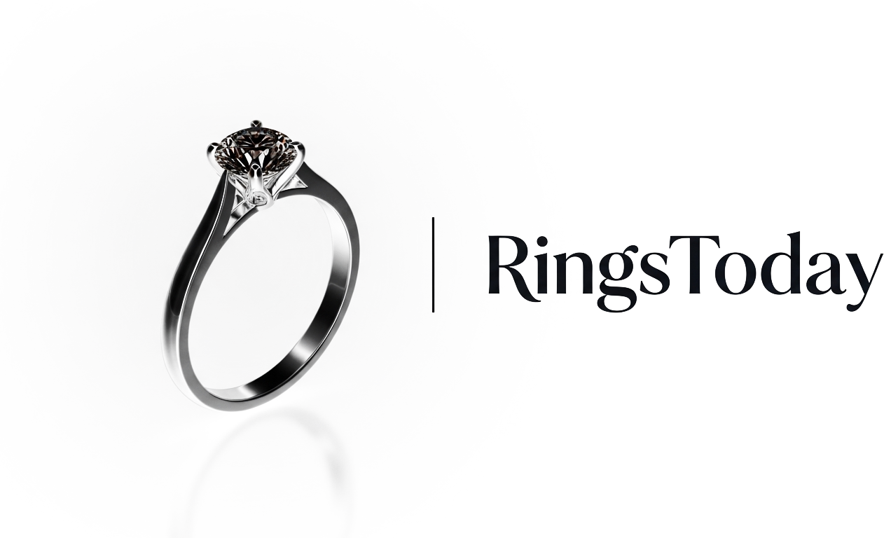
Primary ink. Headlines, body copy on cream, primary buttons, and the logo mark stroke.
One canonical reference for how RingsToday looks, sounds, and is used. Every swatch, type spec, and logo on this page is rendered from the same tokens module and committed SVGs the rest of the app uses, so this page can't drift from the live product.
One word, capital R, capital T. Never “Rings Today” or “ringstoday.com” in body copy.
Set in Inter, uppercase, with a hairline gold rule above when used inside the lockup.
RingsToday is the private diamond concierge for grooms-to-be who'd rather skip the sales floor. Three IGI-certified rings, one private link, her honest reaction — then a hand-set ring shipped insured to your door in seven to twenty-one days. Confident, quiet, and atelier-direct, with no commission floor between you and the bench.
Save this guide for offline review or open the parallel logo concept showcase.
Every variant below is a real committed SVG file under public/. The 'Download assets' button bundles the same files into a zip alongside a generated spec readme.
brand/logo/concept-1/lockup-horizontal.svgbrand/logo/concept-1/lockup-horizontal-ondark.svgbrand/logo/concept-1/lockup-stacked.svgbrand/logo/concept-1/lockup-stacked-ondark.svgbrand/logo/concept-1/mark-only.svgbrand/logo/concept-1/mark-only-ondark.svg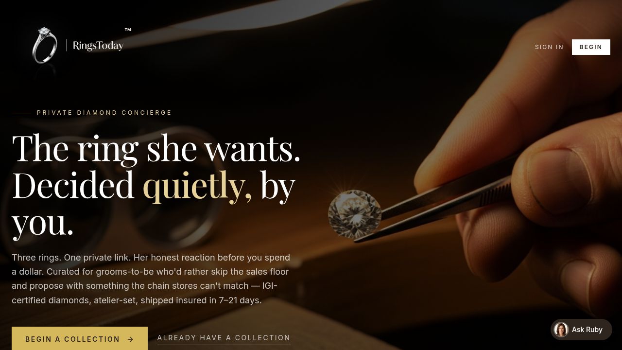
opengraph.jpg· 1200×630Maintain a halo of at least 0.5× the mark's rendered height on every side. Nothing — text, photography, dividers — is allowed into that halo.
Each swatch below paints from the same CSS variable the rest of the app uses. Adding a sixth named brand color is a brand decision — not a design ticket.
--primaryPrimary ink. Headlines, body copy on cream, primary buttons, and the logo mark stroke.
--backgroundDefault page background and the negative space inside the lockup.
--accentAccent only — the diamond in the mark, the gold divider, eyebrow rules, and the primary CTA on dark backgrounds. Never used as body copy.
--muted-foregroundSecondary copy, captions, and policy chrome.
--borderHairline rules, card borders, and the ink-divider underline.
--secondarySecondary buttons and chips on cream backgrounds.
--destructiveReserved for destructive confirmations and validation errors only.
Both display families are loaded eagerly via the @import in index.css; the wordmark serif is loaded for the BrandLockup.
Display serif. All H1/H2/H3, hero headlines, and editorial pull-quotes.
'Playfair Display', Georgia, serifUI sans. Body copy, labels, navigation, buttons, and form fields.
'Inter', sans-serifWordmark only — used inside `BrandLockup` and the committed logo SVGs. Not a body face.
'Cormorant Garamond', 'Cormorant', Georgia, serifFive principles, with sample copy drawn from the existing concierge tone. When in doubt, write the way you'd talk to a single, specific groom — not a list.
We never out-shout the moment. The ring is the headline; we are the steady hand that gets it there.
“Three rings. One private link. Her honest reaction.”
“🔥 BIGGEST SALE OF THE YEAR — DON'T MISS OUT!!!”
Diamond shopping is full of acronyms. We translate before we educate.
“An IGI-certified, lab-grown one-carat — same crystal, same scale, a fraction of the price.”
“Take advantage of our exclusive HPHT/CVD synthetic inventory at sub-rapaport pricing.”
Specifics build trust; superlatives erode it. Use named timelines, named bench partners, named certifications.
“Hand-set by our world-renowned atelier partner, shipped insured in seven to twenty-one days.”
“Lightning-fast luxury delivery from our world-class artisans!”
We never quote, never close, and never push a stone the customer hasn't asked about.
“Want me to pull a second oval at the same budget so you can compare?”
“I can do an extra 5% off if you decide today.”
We say what's lab-grown, what's natural, what's IGI vs GIA, and what the bench can and can't do — every time.
“This is a lab-grown stone, IGI-graded, laser-inscribed. Natural GIA equivalents are about 4× the price; happy to pull either.”
“It's basically the same as a natural diamond — don't worry about it.”
Photography is shot at the bench: walnut surfaces, natural side-light, jewelers' hands in frame. Never on velvet pedestals or against gradient seamless backdrops.
Backgrounds favor cream and walnut, with the gold accent reserved for the diamond itself or a single ribbon of fine reflection. No saturated brand colors in the frame.
A single ring, a single hand, a single tool. Group shots are reserved for the 'three rings' editorial moment on the landing hero.
Section breaks use the `ink-divider` (1px hairline) or `gold-divider` (champagne gradient) utility classes from `index.css`. No drop shadows, no bevels, no gradients elsewhere.
The `.grain` utility (paired-radial-gradient noise) sits behind hero and brand surfaces to keep cream backgrounds from looking flat in print or on OLED screens.
Don't display the wordmark without the ™ at its upper right. The RingsToday name and lockup are the subject of pending U.S. federal trademark applications, so the mark must always appear — on-site it is applied automatically by BrandLockup; for static exports composite an equivalent ™. Switch ™ → ® once a registration certificate issues.
Don't recolor the mark or the diamond — Walnut stroke and Champagne fill are non-negotiable.
Don't stretch, skew, or rotate the lockup. Scale uniformly only.
Don't pair the wordmark with a different serif (e.g. Times New Roman, Garamond Premier). It must render in Cormorant Garamond or its Georgia fallback.
Don't drop the lockup onto a busy or low-contrast photograph. Use the on-dark variant on imagery, with at least 50% luminance separation.
Don't add taglines, country marks, or sub-brands inside the clear-space halo around the lockup.
Don't reproduce the mark below 16px tall or the lockup below 24px tall — at that size the diamond facets fill in and the wordmark stops being legible.
Don't use the Champagne accent for body copy or large fills. It exists to highlight, not to read.
Don't introduce drop shadows, bevels, or gradients onto the mark. The brand is flat, hairline, and quiet.